// ============================================================================= // HEADER (CSS) // // 1. Setting font size of header-logo to 0, since wrapper element may vary, and // inline-block whitespace messes with header height. Font-size is reset to // appropriate size on header-logo-text. // 2. Needs left/right margin so it doesn't cover left/right nav bar toggles // 3. Offset the letter-spacing on the last character by adding a right negative // margin. This centers the text logo properly. // 4. When the word "cart" is added to the mobile header's cart link, add more // margin to compensate. // 5. When logo size is set to "original", we don't have advance knowledge of the // image size, so we can't use absolute positioning + padding to reserve space // for lazy loading. // // ----------------------------------------------------------------------------- .header { background-color: $header-bg; border-bottom: container("border"); position: fixed; top: 0; width: 100%; z-index: zIndex("higher"); @include breakpoint("medium") { border-bottom: container("border"); overflow: visible; position: relative; } &.is-open { height: 100%; @include breakpoint("medium") { height: auto; } } } .header-logo { font-size: 0; // 1 margin: 0 remCalc($header-toggle-width); // 2 text-align: center; @include breakpoint("small") { // 4 margin-left: remCalc($header-toggle-width * 1.5); margin-right: remCalc($header-toggle-width * 1.5); } @include breakpoint("medium") { margin: (spacing("double") + spacing("base")) auto (spacing("double") + spacing("single")); padding: 0; .header.fixed & { background-color: color("greys", "lightest"); margin: 0; padding: spacing("quarter") 0; position: absolute; top: 0; width: 100%; } } > a { @include clearfix; color: $storeName-color; display: inline-block; padding: $header-logo-paddingVertical 0; position: relative; text-decoration: none; width: 60%; z-index: zIndex("low"); // scss-lint:disable NestingDepth @include breakpoint("medium") { background: none; border-bottom: 0; display: inline; padding: 0; width: 100%; } &:hover { color: color("link", "hover"); } &:active { color: color("link", "active"); } } } .header-logo--left { text-align: left; @include breakpoint("medium") { margin-left: remCalc(40px); } .header-logo-image { right: unset; } } .header-logo--right { text-align: right; @include breakpoint("medium") { margin-right: remCalc(40px); } .header-logo-image { left: unset; } } .header-logo-text { display: block; font-family: $fontFamily-hero; font-size: $fontSize-logo-small; // 1 font-weight: fontWeight("bold"); letter-spacing: remCalc(2px); margin-left: auto; margin-right: auto; overflow: hidden; padding: remCalc(3px) 0; text-overflow: ellipsis; text-transform: uppercase; white-space: nowrap; @include breakpoint("small") { font-size: $fontSize-logo-medium; padding-bottom: 0; padding-top: 0; } @include breakpoint("medium") { display: inline; font-size: $fontSize-logo-large; margin-left: 0; margin-right: -(remCalc(2px)); // 3 max-width: none; overflow: auto; white-space: normal; .header.fixed & { font-size: fontSize("larger"); } } } .header-logo-image-container { position: relative; } .header-logo-image-container::after { content: ""; display: block; padding-bottom: remCalc($header-height) - $header-logo-marginVertical * 2; @include breakpoint("medium") { padding-bottom: get-height(stencilString("logo_size")); } } .header-logo-image { @include lazy-loaded-img; max-height: remCalc($header-height) - $header-logo-marginVertical * 2; @include breakpoint("medium") { max-height: none; } } .header-logo-image-unknown-size { // 5 max-height: remCalc($header-height) - $header-logo-marginVertical * 2; @include breakpoint("medium") { max-height: none; } } // // Mobile Menu Toggle // // 1. Animate lines from 'x' to hamburger // ----------------------------------------------------------------------------- .mobileMenu-toggle { @include square($header-toggle-width); display: inline-block; font-size: 0; left: 0; overflow: hidden; padding: 0 remCalc(18); position: absolute; z-index: zIndex("high"); @include breakpoint("medium") { display: none; } .mobileMenu-toggleIcon, .mobileMenu-toggleIcon::before, .mobileMenu-toggleIcon::after { background: $header-font-color; content: ""; display: block; height: 2px; position: absolute; transform: rotate(0deg); transition: transform 100ms ease-in, top 100ms ease-in 150ms, bottom 100ms ease-in 150ms; // 1 width: remCalc(20); } .mobileMenu-toggleIcon { top: remCalc(27); transition: background-color 10ms ease-in 100ms; } .mobileMenu-toggleIcon::before { top: -0.5rem; } .mobileMenu-toggleIcon::after { bottom: -0.5rem; } &.is-open .mobileMenu-toggleIcon { background-color: transparent; transition-delay: 100ms; // scss-lint:disable NestingDepth &::before, &::after { background-color: $header-font-color; bottom: auto; top: auto; transition: transform 100ms ease-in 150ms, top 100ms ease-in, bottom 100ms ease-in; // Animate lines from hamburger to 'x' } &::before { top: 0; transform: rotate(45deg); } &::after { bottom: 0; transform: rotate(-45deg); } } }

Explorer

Explorer

  • Product
  • Qty in Cart
  • Quantity
  • Price
  • Subtotal
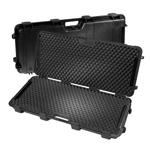
  • Explorer Gun Case w/Dual Combilocks Explorer Gun Case w/Dual Combilocks

    Explorer Gun Case w/Dual Combilocks

    Explorer

    $129.98
    The Bow & Rifle Case is, unlike other EXPLORER Cases, not waterproof but water resistant. It comes with four quick release “up & over” catches, two combination locks, a rubber...
    $129.98
    Qty in Cart: 0
    Quantity:
    Price:
    $129.98
    Subtotal:
  • Explorer 9413 Hard Case w/Foam & Wheels NTOA Approved Explorer 9413 Hard Case w/Foam & Wheels NTOA Approved

    Explorer 9413 Hard Case w/Foam & Wheels NTOA Approved

    Explorer

    $200.00
    RED is the new series of Tough Commercial Cases by EXPLORER Cases, designed for hunters and outdoorsmen. Based on the classic EXPLORER Professional Cases, these cases are priced to compete with mass...
    $200.00
    Qty in Cart: 0
    Quantity:
    Price:
    $200.00
    Subtotal:
  • Total: items /

Adding your products to cart